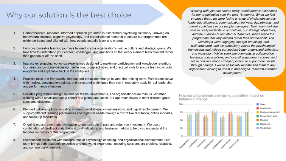
Take a look at this example of a pitch presentation slide on why you should partner with us at Higson. What do you think?
It’s a terrible slide. (We had a lot of fun making it bad on purpose!)
But this isn’t just a design issue – it’s a classic example of the dilution effect in action.
This is a cognitive bias where the persuasiveness of your key messages are weakened by the addition of irrelevant, weaker or neutral information. If you are interested in learning more about the theory and research behind this concept, we recommend watching Niro Sivanathan’s brilliant TED talk. What’s diluting our “Why Higson” message
Too much information on one slide, the key messages are not clear. If you were trying to read this slide, you may be tempted to start skimming or give up reading altogether
A lot of distracting visuals: the photo in the background on the left makes reading the text much harder. There is also a random orange triangle which is there for no real reason (orange is not even one of our brand colours!)
Use of data: the graph on the bottom right is small so makes it difficult to read, and the key messages that the data is meant to convey are not clear. Also, does this graph add that much to convey our positive impact on behaviour change in the first place?
Other dilution-related pitch presentation mistakes we frequently come across
Value proposition: sharing all the details about our services and what we do, when it might not all be relevant to the target audience. This is reminiscent of throwing a bunch of noodles at a wall and hoping something sticks
Not bringing out the value to the client/audience (what’s in it for me?) when sharing information
Using a lot of jargon, which may not be known or understandable to some of the audience. This can create dilution as the jargon can be perceived as irrelevant or less relevant information in our audience’s mind, and can reduce the perceived value of the information shared
Dilution has huge implications for proposals, presentations, reports, and thought leadership.
When we include everything, nothing ends up standing out. Our audience has to work harder to make sense of what we’re saying, and our best points lose their impact.
The good news? If we become more intentional in how we select, structure, and communicate information, we can dramatically increase how clearly our message lands – and how convincing we are. So how can we challenge dilution? There are three angles that we need to be intentional about around dilution:
What to include
Why it matters (to your audience)
How you structure the information
WHAT TO INCLUDE
Less is more: a clichéd expression, but it exists for a reason!
What are the key messages and information that you want to convey?
What information is less relevant or unnecessary?
In the context of a proposal/pitch: can you put some of the more detailed/potentially less relevant but necessary slides in the appendix?
An interesting thought experiment to test the relevance of your information: if you had to cut 30% of content while still keeping the same outcomes and key messages, what would you cut out?
WHY IT MATTERS (TO YOUR AUDIENCE)
Focus on the WIIFM (what’s in it for me) Who is your target audience? What do they care about? Are you bringing out the value to them and why are you sharing this information with them? We generally don’t do this enough or not as explicitly as we should. Remember that as humans, we have very short attention spans (and they are continually shrinking). If you don’t make it clear why what you are sharing is relevant, people will start tuning out.
HOW YOU STRUCTURE THE INFORMATION
Use the rule of 3 The rule of three is one of the oldest and most effective principles in communication. It is used in literature, comedy, music, marketing, design, even law! As the name suggests, it involves structuring our information into 3 key points. This makes our messages easier to process and remember in our audience’s mind. It also helps us challenge dilution. There are lots of different ways you can use the rule of 3. If we had to pull out 3 (we do have to practice what we preach after all…): 1. For your overarching structure Let’s say you are preparing a pitch presentation. A strong way to use the power of three is to structure it into three distinct sections. This goes further than having an introduction, body and conclusion. Think of the three main overarching points in the body of the pitch presentation. Then you build your sub points underneath each of the three sections. This will give your pitch a clear, strong base structure from which to hang your ideas. Two structures that can work well for pitches: Them – us – we Their challenge, how you can help with it, what would the partnership look like Why – what – how Why are they looking for help? What is it that you have to share? How will you approach the task? You can also of course use this overarching structure idea in other pieces of content, not just pitches! 2. On your slides What are the 3 key points that you want to convey in this slide? Challenge yourself to not share too much. 3. When sharing your value proposition Rather than sharing 10 different reasons why you client/customer should partner with you – what are the three most relevant reasons, tailored to the context of that specific opportunity? How can you bring out the value to the client (What’s in it for me) in each of those points?
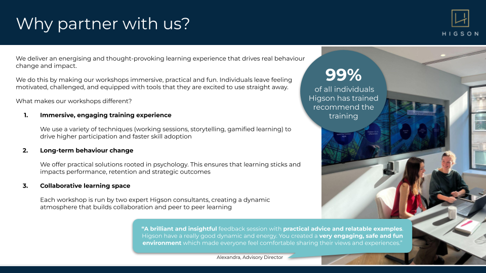
If we go back to our slide example from earlier:
Contrast it against this:
Same slide, very different approach: ✅Less text ✅3 key points that are the most relevant within the context of the opportunity
✅Value to the client (WIIFM) brought out
✅Visuals added to slide but not distracting the communication of key messages
Signpost effectively To bring up another slightly clichéd expression: tell them what you are going to tell them, tell them, then tell them what you told them. This is particularly important when presenting something. Are you clearly linking between the different parts of your presentation, and when you are moving from one point to another? This helps create structure in your audience’s mind, not get lost in your narrative, and process your overall presentation more effectively.
Are your slides a help or a hindrance? If you are presenting with slides, put yourself in your audience’s shoes: they will be listening to what you are saying and processing what is on your slides at the same time. With this dynamic, dilution can happen very easily if there is a mismatch between what you are sharing and what they are reading, or if your slides distract from what you are saying out loud. Could your slides be unintentionally creating dilution by:
Having too much on there
Not being animated so all the information is shown up at once. Instead, animate the points as you are verbally talking through them
Having visuals that are not intentionally supporting what you are sharing. We’re not saying to make your slides boring/with no colour on them! Just make sure that visuals are intentionally used to captivate attention and support your key messages
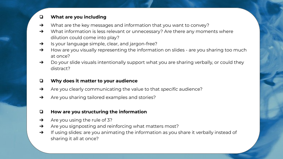
Bringing it all together: checklist to review content against
Many pitch presentation mistakes stem from good intentions – we often care so much that we try to say everything. But persuasive communication isn’t about adding more. It’s about choosing, structuring, and signalling what matters most – that’s what shows our audience that we care about them as well.
Having this concept front of mind, and being more intentional in our approach, can have a powerful impact on how clearly, confidently, and convincingly our message lands.
I now feel that I have the tools to further expand my professional network, a structure to ensure coaching meetings are as efficient and effective as possible, and a variety of theories and tools to refer back to on various business development and leadership topics.
Michael Mizon, Director
We approached the team at Higson with the goal to help provide our growing business development team with the core expertise and soft skills to be successful in their roles. Everyone in the team, across all levels of experience, took away valuable learnings from the programme and gained actionable insights to take forward in their future interactions
Rhys Hodkinson, Chief Commercial Officer
Higson took a measured and personable approach and tailored it to what is quite a multi-faceted and tricky sector. The results have been a solid foundation from which to grow that sales team, and win new clients through various important but simple steps. I certainly hope to hope to work with Higson again as our sales team and business grows.
Hal Waldroper, Senior Associate
Our team were able to put into practice within hours of leaving the workshop and maintain that it was the best training session they had ever had. From a management perspective, we've seen a really measurable increase in productivity and client satisfaction. A great return on investment.